SHARE


Beginner’s Guide to Website Design: Layout, Colors & Fonts
December 23 , 2025 | 8 min read
By WePage Team
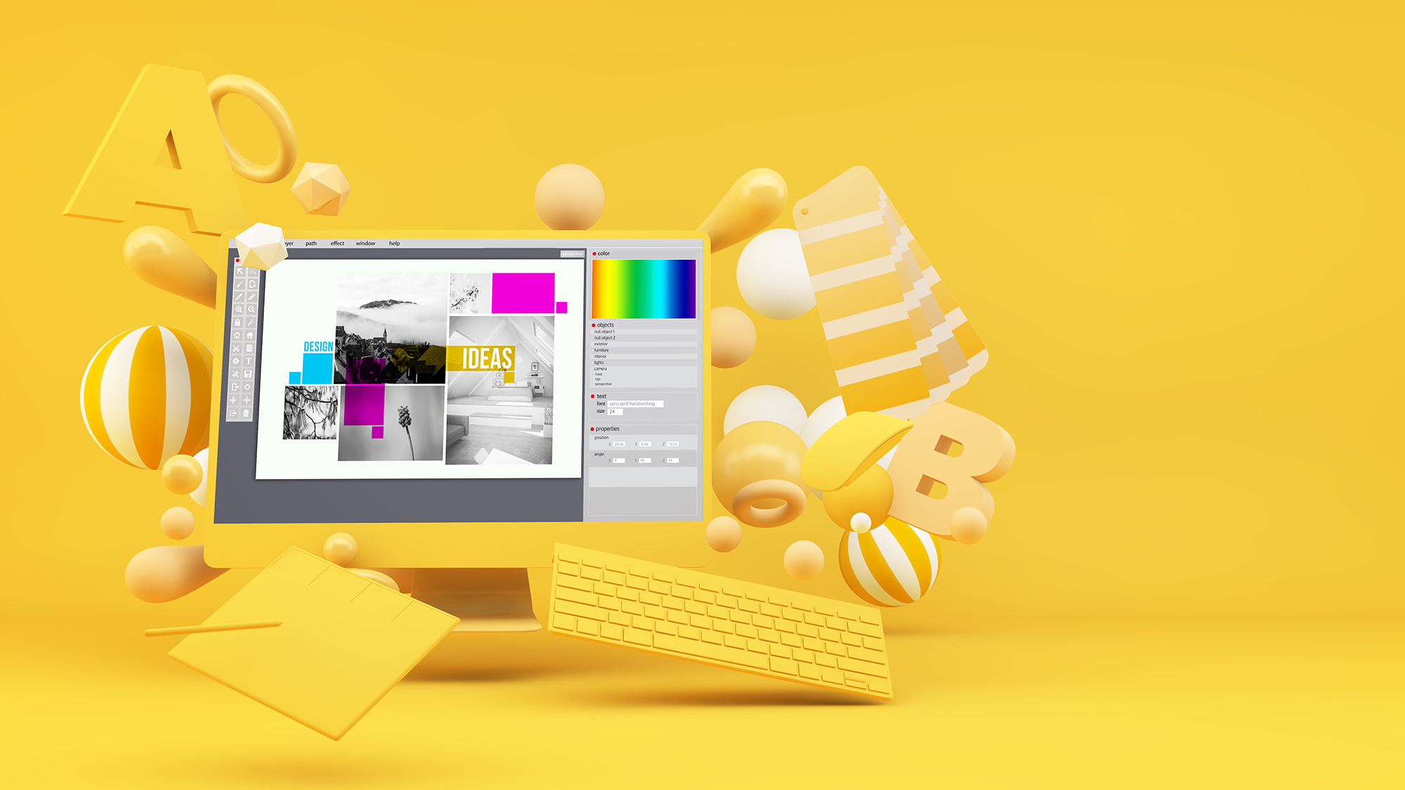
Table of Content
Your website design tells more about you or your brand than words. People who visit your site often decide in seconds whether or not they can trust you. And you don't get a second chance to make a first impression. It’s all visual. If your layout is too busy, your color scheme is off-putting, or your fonts are difficult to read, visitors may leave the site even before reading a single word you’ve written.
On the flip side, clean website layout ideas and properly proportioned colors and fonts can immediately make your website feel professional, inviting, and easy to navigate. For beginners, these fundamentals can be intimidating, but mastering the basics will separate your website from the rest. This guide covers beginner design tips that will help you design a site that looks sharp, attracts attention, and retains visitors.
1. 10 Website Design Tips for Beginners
Ready to create your first website? These beginner design tips will guide you:
1-1. Keep Your Layout Simple and Clean
While in the beginning you are eager to put every feature on your website you can think of, you must understand that too much on your website will be overwhelming. You want your visitor to feel at home on your site. One way you can do this is to create a layout that is as simple as possible. When your site is easy to navigate, your visitor will feel right at home. They will easily know how to find what they are looking for.
So always have an organized header, navigation, and page content flow. Don't put too many boxes, banners, or widgets on a single page. Too many boxes, banners, or widgets on a page will confuse your viewer. A clean layout will lead your visitors' eyes to the content you want them to see: your blog post, product, call-to-action, etc.
1-2. Use Plenty Of White Space
The absence of white space, or negative space, can lead to visual fatigue and make it difficult for users to focus on the information you want to convey. White space is the empty or unmarked area that surrounds text, images, and other elements on a page. It is a crucial web design element that improves the overall readability and aesthetics of your website.
A website with ample white space gives users a sense of order and clarity. Just as punctuation and paragraphs make written content more readable, white space creates pauses on a page, allowing users to process information more easily. Use white space effectively by spacing out paragraphs, images, and sections. You can also use it to create contrast and focus by surrounding key elements with white space. This draws attention to important content and makes it stand out on the page.
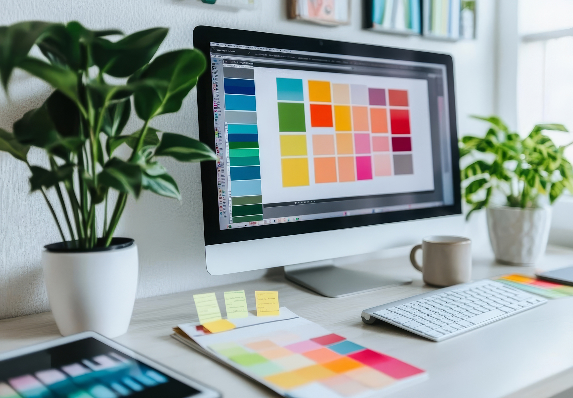
1-3. Stick to a Consistent Color Palette
Colors are a great way to give your website personality and energy. A site with mismatched and random colors will look confusing and unprofessional. Instead, choose a color palette that has 2 to 3 colors and use them consistently across your site. Define which colors you'll use for backgrounds, buttons, and highlights. A consistent and cohesive color scheme will bring harmony and visual interest to your design.
A good color palette starts with a neutral base, such as white, gray, or beige. Then, choose one or two accent colors to add personality to your design. Blue suggests trust and stability, yellow is cheerful and energetic, etc. Once you've settled on a color palette, use it consistently on every page of your site. This will help create a sense of familiarity for your visitors.
1-4.. Limit Yourself to Two Or Three Fonts
Fonts are similar to voices. One voice can be soothing, but five or six all talking at once is noise. A common mistake of new web designers is to include five or six fonts in their sites because they each "look cool". Unfortunately, the result is that none of them stand out, and it leaves visitors confused.
The alternative is to limit yourself to two, perhaps three fonts at the most. A font for headings, another for the text, and if you absolutely have to, a third for accents (quotes, buttons, etc.). The key is consistency. It will make your site look organized and professional. Find fonts that go well together (a strong sans serif for headlines with a clean serif for the text, for instance), and use that combination throughout your site.
1-5. Make Text Easy to Read
Your content may be awesome, but if your visitors can’t read it, they will not stay. Readability is a crucial factor. Start with a readable font size and do not use sizes that are too small. If you do not know where to start in web building, 16px is a good size for body text. For H1s, H2s, and H3, use 32px, 24px, and 18px.
Then there is the contrast. Dark gray text on a white background? Sounds good. Light gray on pale blue? Awful. You get the picture. Be careful not to use too large text blocks. Short paragraphs, bullets, and images make it easier to scan your content. Also, check your line spacing. It's the white space between lines of text. A 1.15 line spacing makes the text easier to read by giving the letters some space to breathe.
1-6. Ensure Mobile Responsiveness
Did you know that 62.4 percent of global internet traffic comes from mobile? Most people visiting your website will be coming from a mobile device, not a desktop computer. If your website only looks good on a full-size screen, people will lose interest before they hit page two. Responsive design ensures your website layout ideas and typography adapt smoothly to any screen size. Buttons should be thumb-friendly to tap, and text should resize so no one has to pinch-scroll to read.
To ensure mobile responsiveness, use a fluid layout that adjusts to different screen sizes. Opt for responsive templates, use auto-scaling for images, and design buttons that are large enough to tap easily. Then, test your site on various devices to identify and fix any issues.
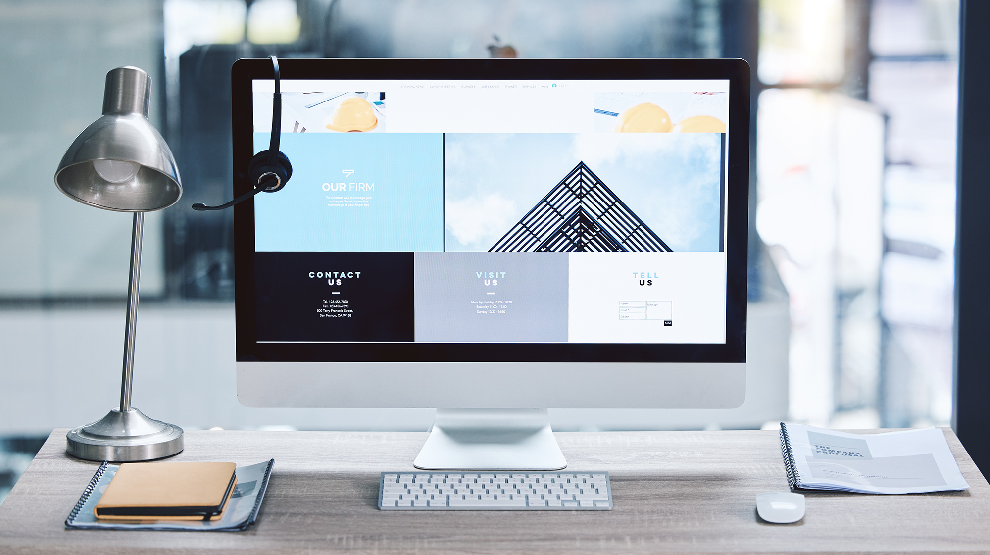
1-7. Create Clear Navigation Menus
Think of your navigation menu as a roadmap for your website. If it’s difficult for visitors to find their way around your site, they will quickly get frustrated and leave. Your navigation should be simple, intuitive, and clutter-free. Keep it to the essentials: Home, About, Services, Blog, Contact, and so on. Don’t overcrowd your menu bar with ten different options. Make sure your labels are clear and to the point. “Our Solutions for Maximum Optimization” might sound fancy, but it’s not clear. “Services” will do just fine.
Consistency is important, so make sure your menu remains the same on every page. This will help visitors know where they are at all times. Dropdown menus are a great way to keep your navigation tidy, but don’t go overboard. Too many layers will make your site feel like a maze. Finally, place your navigation in obvious places (either at the top or on the side). Visitors shouldn’t have to scroll or click around just to find it. A clear navigation bar will build trust with your visitors by showing them that you respect their time.
1-8. Optimize Loading Speed
Did you know that 53 percent of website visitors will leave a website if it takes more than three seconds to load? Site speed is more than a convenience. It’s a fight for your website’s life. When pages take too long to load, visitors become frustrated and even resentful, increasing bounce rates and driving away potential leads and customers. Slow sites also get penalized in Google search results, further shrinking your online visibility and reach.
So why is your site so slow? Heavy images, too many plugins, or inefficient code can all bog down your website. Use image compression tools, enable caching, and eliminate unnecessary scripts and plugins. Use online speed testing tools like Google PageSpeed Insights to identify slow-loading elements on your site.
2. Start Designing with Confidence
Building your first website from scratch can be daunting. However, these beginner designer tips will help you create a site that looks professional and polished, even if you’re just getting started in web design. By starting with simple, clean designs and adding in essential elements, you can easily turn an empty canvas into a functional and beautiful online presence. Remember, the key is to find the right balance; every choice you make should be intentional and help you achieve your goals.
Ready to put these ideas into practice? WePage makes it easy to start building a free website without having to learn any code. WePage is a no-code web builder that’s perfect for beginners and creatives. If you're a Japanese anime fan, you can take advantage of our anime-inspired templates and Japanese travel themes, then customize your site with our easy-to-use design tools. WePage has everything you need to design a website that truly reflects your style and personality.

SHARE
Related articles