Japanese Design Aesthetics for Your Website
December 23 , 2025 | 8 min read
By WePage Team

Table of Content
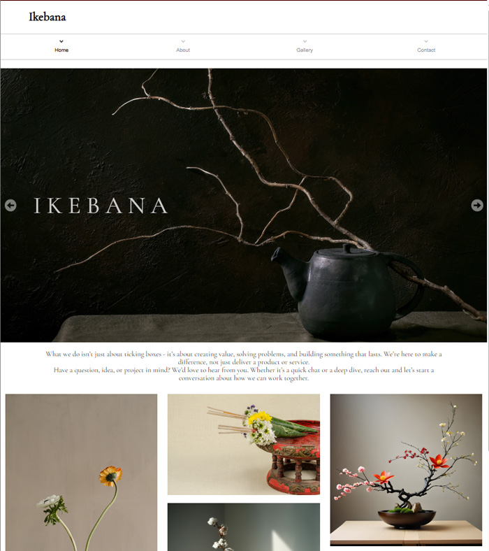
If you’re looking to create a minimalist site design but don’t want it to be as sterile and boring as most minimal website design examples out there, you may find a little bit of inspiration in Japanese design concepts. It’s no secret that Japan is big on minimalism. Everything from their culture, tradition, and art forms reflect this. So it shouldn’t come as a surprise that Japan can teach you a thing or two about minimalist web design, especially when you look at the history of Japanese minimalist design.
Creating a website doesn’t have to mean adding layers upon layers of unnecessary and visually heavy graphics and fonts. Instead, a minimalistic approach using simple shapes, structure and a keen eye for detail can go a long way in creating a pleasing and functional web design. Your website should be a welcoming experience that customers enjoy, not a headache or something to be scrolled past as quickly as possible. Take your web design to the next level by drawing inspiration from Japanese design culture.
1. Key Elements of Japanese Design Aesthetic
Website design japanese aesthetic is simple, balanced, and instantly recognizable, here are the elements that define it:
1-1. Ma (Negative Space)
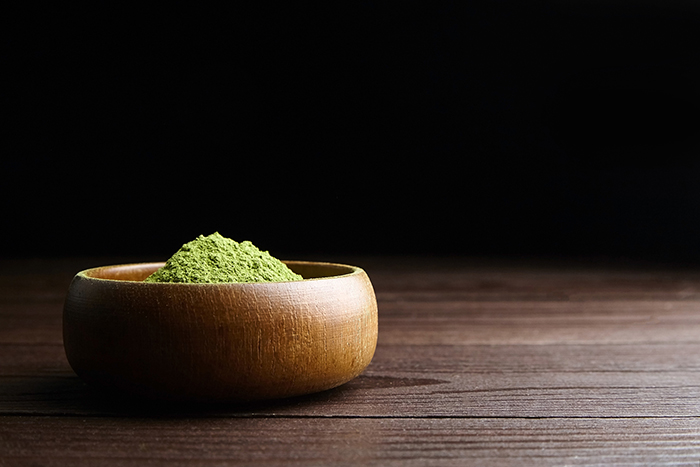
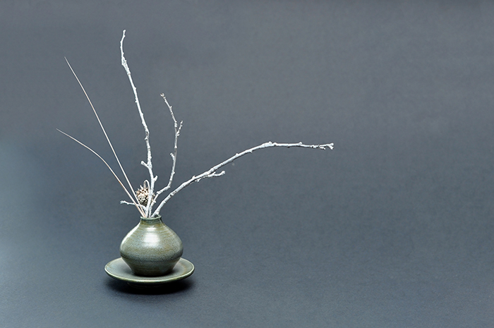
Ma is a Japanese design principle that emphasizes the importance of negative space. Applying ma in web design means that you don’t pack too much into a single page. You give your design room to “breathe.
The white space between the lines of text, images, and buttons on your site makes each element stand out clearly and crisply on the page. It helps a viewer know exactly where to look without having to scan over every block of images and text that are all fighting for their attention.
Applying Ma to your website design is simple. First, start by reducing and simplifying your layout. Be generous with your spacing and leave room around your headings, paragraphs, and images. Grids are your friend here as well, to keep your content from feeling too scattered or unorganized. Also, pay close attention to the margins and padding that you can set for your layouts. And if you’re having trouble, try removing one element from the page and see if it looks cleaner. In most cases, less is more.

1-2. Wabi-Sabi (Imperfection and Simplicity)
Wabi-Sabi celebrates imperfection instead of cold, rigid perfection. In Japanese web design, you can interpret it as allowing your site to be less "perfect." Imperfections could be natural-looking or organic shapes instead of sharp, geometric shapes. Or it could be hand-drawn or imperfect icons rather than clean, vector-based graphics.
Wabi-Sabi is useful because we all relate to imperfection and humanity. A site that is too "perfect" or polished might come across as distant, cold, or artificial. But a website with little imperfections will feel more relatable.
To implement wabi-sabi on your site, try to relax about perfection. Use muted, earthy colors rather than bright, intense shades. Include real photos instead of stock photography. Experiment with imperfect or organic shapes and handmade typography. You could add natural textures, like paper, wood, or stone patterns, as well. The key is to strike a balance; it should still look designed and intentional but with subtle quirks and rough edges.
1-3. Kanso (Minimalism)
Kanso translates to simplicity. It's the concept of removing clutter to achieve clarity. In the world of Japanese aesthetics, this is the elimination of the “unnecessary.” Your website is no place for filler. Every element should have a reason for being there. If it doesn’t serve your user, remove it from the design.
This Japanese minimalist style can help you cut the clutter and at the same time improve your user experience. A minimal design will load faster. It will be easier for your visitors to navigate. And they won’t feel overwhelmed or lost, because there won’t be dozens of menus and distractions.
To apply Kanso to your own web design, start by evaluating your current site. What can you remove? Ask yourself if this button, image, or paragraph of text is truly necessary. If not, delete it. Limit your color palette and typography choices. Keep your menus clean, simple, and easy to find. Use whitespace as part of your minimal aesthetic.
1-4. Shibui (Subtle Beauty)
Shibui means subtle beauty: the type of aesthetics that doesn’t need to show off, but still works wonders. When it comes to Japanese website design, it translates into not using too much loud and flashy graphics.
How is it useful? Subtlety is timeless. While a website with endless animations and screaming gradients might look cool for a while, it will probably start to look dated fast. Subtle beauty, however, evokes trust and makes visitors feel at ease.
To implement Shibui, think about those small design details, which are not particularly noticeable at first sight, but make a good impression. These could be a faint paper-like texture behind your main content, soft gradients that shift slowly between two calming colors, or subtle hover effects that glide instead of bounce. Use gentle textures or gradients in the background. Pick thin and elegant sans-serifs, or a classic serif font. And make your animations less flashy, and more smooth and consistent.
1-5. Seijaku (Tranquility)
Seijaku refers to stillness, peace, and calm. In website design, you can apply it by creating a peaceful user experience. Imagine your website as a place where visitors can pause and slow down their fast-paced lives.
Nowadays users are bombarded with information and distractions, leading to anxiety and a need for calm. If your site is the place where visitors find peace, they’ll come back, read, and explore it, assured they’ll feel at ease. Moreover, the design trends of today often lean toward minimalism and focus on reducing distractions, which aligns perfectly with the Seijaku principle.
Incorporating the Seijaku design principle requires a more subtle approach to design. Opt for muted, calm color schemes. Use smooth, gentle animations instead of flashy, abrupt ones. Keep pop-ups to a minimum or use them non-intrusively. Allow your typography to breathe with enough whitespace.

1-6. Balance and Harmony
Japanese style websites primarily focus on achieving balance. You can easily see this in the way colors are paired, shapes are balanced, or content is arranged on a page. In web design, harmony translates to balance between each design element. They should all complement each other and not fight for attention on the page.
But why is harmony important to web design? It makes a site more trustworthy. Harmonious design isn’t something your visitors are necessarily aware of, but they feel it. If every element of your site is competing with the next for their attention then your site will feel uncomfortable and a bit off-putting.
Balance can be as simple as keeping to your style guide and following a clear set of design rules across the site. Use a restricted color palette and make sure the different tones go with each other. Typography also needs to be balanced. Don’t use more than two or three fonts throughout the website. Visual weight also matters, if you have a large picture on the left-hand side, you need to balance it out with text or a series of smaller pictures on the right-hand side.
1-7. Asymmetry (Fukinsei)
Fukinsei means to not have perfect symmetry or balance. In web design, this concept could be implemented by intentionally avoiding centering an element on a web page. Symmetry and centered elements can look great but sometimes, having an element off-center can guide the eye more or add flow to a web page.
Fukinsei is useful because symmetrical designs are comfortable and can quickly become dull. Asymmetrical design is often more dynamic and contemporary. Asymmetrical design can also add an intentional and curated feeling to your site instead of a templated, impersonal feel.
Applying Fukinsei can be as simple as experimenting with layouts. Not centering an image, creating staggered blocks of text that offset as the user scrolls, or layering and overlapping elements on a page, like text over an image. The key to Fukinsei is maintaining symmetrical and asymmetrical balance. While playing with unevenness, you don’t want the design to be out of control. Pairing asymmetry with simplicity often works best to ensure it looks intentional rather than messy.
2. Bring Japanese Aesthetics to Your Website
Incorporating Japanese design principles into your website design isn’t about imitating a style or “trying too hard.” It’s about thinking holistically, and crafting an experience that’s clean, balanced, and uncluttered. From the power of Ma’s negative space, to nature-inspired color schemes, each element of Japanese web design serves a purpose and helps create a more intuitive, calming browsing experience.
The best part is that you don’t have to be a design guru to bring these elements into your site. A no-code website builder like WePage gives you a simple way to harness the beauty and authenticity of Japanese aesthetics in a site that truly feels your own. WePage has a variety of templates that celebrate Japanese culture, from anime-inspired illustrations to Japan travel themes that truly evoke a spirit of adventure. Build a personal blog, online store, or creative portfolio using WePage’s intuitive drag-and-drop editor. Get started for free today.
Related articles


