SHARE


What Makes a High-Converting Homepage in 2026?
March 25, 2026 | 4 min read
By WePage Team

Table of Content
Your homepage does more work than most people think.
It’s not just there to look polished. It’s where visitors quietly decide whether your business is worth their time. And that decision happens fast.
In 2026, attention is short and expectations are high. If your homepage isn’t clear within a few seconds, people move on. This is especially true for small business websites, where trust and clarity matter more than design trends.
So instead of trying to impress, a high-converting homepage focuses on something much simpler. It helps people understand what you do, who it’s for and what they should do next.
1. What Your Homepage Actually Needs to Do
A lot of websites still try to say everything at once. They introduce the brand, list every service and present multiple actions all at the same time.
But that’s not how people use websites.
They scan. They look for signals. They decide quickly. So your homepage only needs to do one thing well. Guide the visitor. Everything else supports that. Structure Comes Before Design This is where most people get stuck.
They start with colors, images or layout ideas before thinking about structure. But structure is what drives action.
A strong homepage usually follows a simple flow. A clear opening message, a primary call to action, supporting proof, then a short explanation of what you offer.

2. The First Screen Matters Most
The section people see before they scroll carries the most weight.
If this part is unclear, the rest of the page won’t save it. A good test is simple. If someone lands on your homepage for the first time, can they immediately understand what you do. If not, simplify it. Avoid vague phrases and say exactly what you offer.
3. Call to Action: Keep It Focused
This is one of the biggest conversion issues.
Many websites offer too many options at once. Contact us, learn more, view services, get started. When everything is competing, nothing stands out an in most cases, one clear action is enough. Then repeat that action as visitors scroll so it stays visible.
4. Trust Is What Makes People Act
Even if your homepage looks good, people won’t take the next step unless they feel comfortable.
Trust isn’t built through design alone. It comes from signals. Things like testimonials, clear contact details and real images all help. You don’t need a lot of them, just enough to feel credible.

5. Avoid Overloading the Page
It’s tempting to include everything on the homepage, especially when you’re trying to explain your business. But more content usually makes things harder to follow. A better approach is to keep sections short and link to deeper pages.
That way, visitors can explore at their own pace.
6. Location Still Matters
For local businesses, this is often overlooked. People want to know where you are or where you operate. A simple location section or map adds a layer of reassurance that your business is real and accessible.
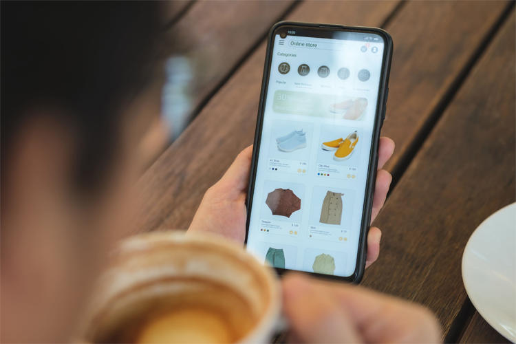
7. Mobile Experience Isn’t Optional
Most visitors will see your homepage on a phone so even if your design looks great on desktop, it still needs to work on smaller screens. Check readability, spacing and button size.
If something feels cramped, simplify it.
8. Common Mistakes That Hurt Conversion
Once you start looking for them, you’ll see these everywhere. Unclear headlines, too many calls to action, no trust signals and cluttered layouts. Fixing these often improves performance more than redesigning everything.
A high-converting homepage isn’t about doing more. It’s about doing the right things clearly. When visitors understand your offer and feel confident taking the next step, conversions happen naturally. Focus on clarity, structure and trust. The rest becomes much easier.
9. Getting Started With WePage
If you’re building your homepage from scratch, using a tool like WePage can make the process much easier. It gives you a structured starting point so you’re not guessing layout decisions. It also keeps things simple, which is usually what leads to better results.
SHARE
Related articles