SHARE


Simple Website Layout Tips That Improve User Experience
April 10, 2026 | 7 min read
By WePage Team
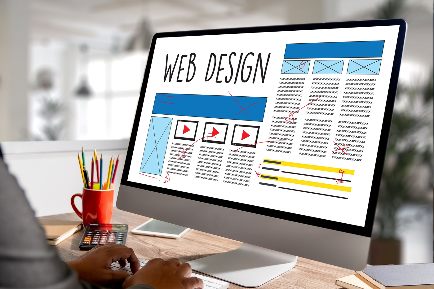
Table of Content
A lot of website frustration comes from something visitors almost never name directly. - layout.
They do not usually say, “this page has weak visual hierarchy” or “the spacing is making this hard to scan.” They just leave. Or they hesitate. Or they stop reading before they reach the point where your site was supposed to convince them.
That is why layout matters so much. It shapes how easy your website feels to use. And in many cases, improving user experience has less to do with changing colors or fonts and more to do with putting the right things in the right places.
For beginners, this is actually good news. You do not need advanced design skills to improve layout. Most of the strongest changes are simple. Better spacing. Clearer section order. Fewer competing elements. Stronger page flow.
These are practical decisions, not artistic ones.
1. Where Things Can Go Wrong
One of the most common layout mistakes is trying to show too much too early. Business owners naturally want visitors to see everything important right away.
The problem is that too many elements competing for attention make it harder for people to process anything clearly. When a page feels crowded, people start scanning without really taking things in. They may not know why the page feels stressful, but they still react to it.
A better approach is to give each section a clear role.
- One section introduces the business.
- Another explains the core offer.
- Another builds trust.
- Another points to the next step.
When sections have distinct jobs, the page feels easier to follow because the visitor does not have to do the organizing mentally.
This creates a natural flow. Instead of jumping between ideas, the visitor is guided step by step. That sense of flow is one of the biggest differences between a website that feels easy and one that feels confusing.
2. Spacing creates clarity
This is where spacing becomes powerful. White space is often misunderstood as something decorative, but it plays a functional role. It gives content room to breathe. It separates ideas. It reduces the sense of clutter.
A website with decent spacing almost always feels more usable than one where everything is packed tightly together, even if the words are exactly the same.
Spacing also helps create rhythm. When sections are clearly separated, the page feels structured. When everything blends together, it feels harder to follow. Even small adjustments to padding and margins can change how a page feels dramatically.
3. Better Formatting
Headings matter here too.
Strong layout supports scanning, and headings are part of that system. Visitors rarely read line by line from the top of a page. They look for anchors. Clear section headings help them understand where they are and whether the content underneath is worth their attention.
If headings are vague, the page becomes harder to scan. If they are specific, the entire layout feels smarter.
The same principle applies to paragraphs. Long unbroken blocks of text create resistance, especially on mobile. Shorter paragraphs are not just easier to read. They make the whole layout feel lighter. This is why websites that are written well can still feel hard to use if the text is dumped into dense walls.
Breaking content into smaller sections improves both readability and engagement.
4. Better Navigation Leads The Way
Navigation is another layout decision that affects user experience more than people think.
Menus should make movement easier, not create more decisions. When there are too many top-level navigation items, visitors often pause because they are not sure where to start. A smaller set of clearer options usually performs better.
For many small business websites, the key pages are:
- Homepage
- About page
- Services page
- Contact page
It also helps to think about where buttons and next steps appear.
A call to action should feel like a natural continuation of the section above it. If you place a button randomly, it can feel disconnected. If you place it right after a strong explanation or a trust-building block, it feels easier to act. This is one of the reasons layout influences conversion so directly.
Good structure reduces the effort required to decide.
5. Mobile Layout Matters More Than Ever
Mobile layout is where a lot of websites quietly fail. A page that feels fine on desktop can become awkward on a smaller screen. Text wraps differently. Images push important content too far down. Buttons feel too close together.
This is why mobile-friendly layout is not just about shrinking the design. It is about making sure the experience still feels easy when viewed on a phone.
- A mobile-friendly page prioritizes clarity.
- Important information appears early.
- Buttons are easy to tap.
- Sections are short enough to scan without fatigue.
These details may seem small, but they strongly influence how usable your site feels.

6. First Impressions Last
One useful habit is to review your site as if you were a first-time visitor on your phone.
Can you immediately tell what the page is about?
Is the main action obvious?
Do any sections feel too long or too cramped?
This kind of review usually reveals more than staring at the page from the perspective of the person who built it.
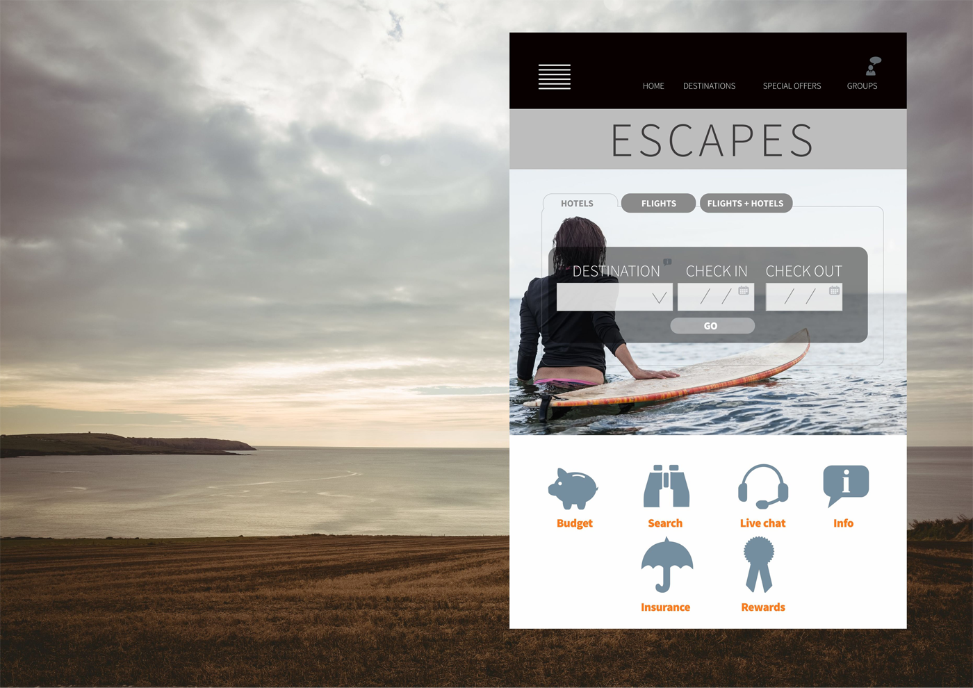
Image placement also plays a big role in layout. Images should support the page, not interrupt it.
If every section has a large image whether it needs one or not, the layout starts to feel repetitive and heavier than it needs to be. On the other hand, a well-placed image can break up text, reinforce the message and create rhythm.
The key is to use visuals intentionally.
7. Reducing Visual Noise
Another layout improvement that often helps is reducing visual competition.
Too many styles, too many button colors, too many different card formats or too many mismatched image sizes make a site feel less stable.
Consistency in spacing, image treatment and button style makes everything feel calmer,. That calmness improves usability and builds trust.
A consistent layout feels more professional, even if the design itself is simple.
This is one area where structured website builders can help a lot.
A platform like WePage gives you templates that already respect basic layout principles, which means you are not making every design decision from scratch. That reduces the chance of accidental clutter.
It also means you can focus more on clarity and content rather than trying to invent a page structure from zero.
8. Editing Improves Layout
Something else that improves user experience is being honest about how much content a page needs.
Not every page needs a long scroll. Not every section needs a photo. Not every idea needs equal space. Sometimes a layout gets better when you remove one section instead of adding three.

That kind of editing instinct is often what makes the final result feel more professional.
Simple layout does not mean plain. It means deliberate. It means someone can land on your website and feel like the information is where it should be.
That feeling is what good user experience usually comes down to.
One practical test is to scroll through your own website without reading every word.
Just scan it.
If the page still feels organized and the key actions still stand out, the layout is probably doing its job.
If everything blends together, the page may need stronger spacing, clearer headings or a simpler section order.
This is also why it helps to build from a clear template rather than improvising every page. Strong layout is rarely accidental. It comes from repeated patterns that reduce effort for the person using the site.
9. Final Thoughts
When a website feels easy to use, people stay longer, read more and act with less hesitation.
That is not usually the result of one big design idea. It comes from small layout choices that make the page easier to follow.
If you want a better user experience, start there. Reduce clutter, improve spacing and make the next step obvious.
Those changes often do more than a redesign ever will.
SHARE
Related articles