SHARE


How to Create a Portfolio Website to Showcase Your Work
April 10, 2026 | 6 min read
By WePage Team
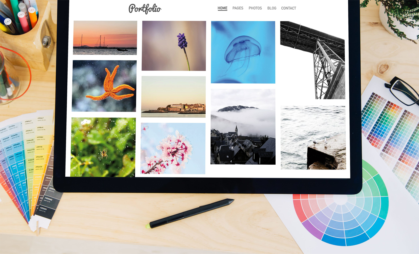
Table of Content
For a lot of creative professionals, the hardest part of building a portfolio website is not choosing the work. It is figuring out how to present it.
You know your projects. You know what went into them. But turning that into a website that feels clear, confident and professional is a different challenge. That is where portfolio sites often split into two extremes. Some become overloaded, with too much work and not enough structure. Others become so minimal that visitors do not get enough context to understand the value behind what they are looking at.
The best portfolio websites sit somewhere in the middle.
They show strong work, but they also guide the viewer. They make it easy to understand what kind of projects you do, what your style looks like and what someone should do if they want to work with you. That matters because a portfolio site is not just an archive. It is part presentation, part filter and part sales tool.
For designers, photographers, illustrators and freelancers, the homepage often sets the tone immediately. It should quickly communicate the type of work you do and the level of quality someone can expect. It does not need to explain everything at once, but it should make the direction obvious. A clear introduction helps. So does a focused selection of featured work. This is one area where restraint usually helps more than volume. Showing fewer, stronger examples often creates a better impression than showing everything you have ever done.

1. Structure Your Website
One of the most useful shifts in thinking is to stop treating your portfolio as a personal gallery and start treating it as a guided experience. A visitor is not only asking whether the work looks good. They are asking whether you are the right fit for what they need.
That is why categorizing your work matters. If your portfolio mixes branding, photography, web design and illustration without any structure, people have to work too hard to interpret it. Simple categories, project types or case-study groupings make the site much easier to use.
Context also matters more than many people expect. A project image on its own can be visually impressive, but adding even a short explanation can make it far more persuasive. What was the goal. What did you contribute. What changed as a result. That extra layer turns a piece of work into evidence.
This is especially true for freelance and client-based work. Potential clients are not only admiring the output. They are trying to imagine what it would be like to hire you. A clean image might attract attention, but a concise case study helps create trust.
That is why an About page belongs on a portfolio site, even if it is short. People want to know who is behind the work. They want a sense of your approach, your experience and your style of collaboration. It does not need to be overly personal. It just needs to feel real. A short explanation of what you do, the kind of projects you like and how people can work with you is usually enough.
A good contact path matters too. This sounds obvious, but a surprising number of portfolio websites make it hard to reach the person behind the work. A visible contact page, a simple enquiry option or a direct email link can make a big difference. If a visitor likes your work, the next step should not feel hidden.

2. Use Clean, Simple Templates
Another thing worth remembering is that portfolio websites do not need to be over-designed to feel impressive. In fact, over-design often gets in the way. If the transitions, layout tricks or visual effects compete with the work itself, the portfolio becomes harder to read. For many professionals, cleaner is stronger.
This is where simpler templates can help. A platform like WePage can give you a clean starting point that puts the emphasis where it belongs, on the work and the message around it. That makes it easier to focus on curation and presentation rather than fighting with layout.
The way you order projects also matters. Most visitors will not browse every page. They will make an impression quickly, which means the first few examples carry more weight than the rest. Lead with the work that best represents what you want more of. Not just your favorite work, but the work that supports the type of client you want to attract.
That idea alone changes how many people build portfolios. Instead of showing everything equally, you start curating strategically. The site becomes less about your history and more about your direction.
This can also make writing easier. You are not trying to document every detail of your career. You are helping someone understand what you do well right now.
Usability matters too. A portfolio website can look beautiful and still be hard to use. If the navigation is unclear, the images load slowly or the site feels awkward on mobile, the work loses impact. Many visitors will find your site from a social link, referral or search result and view it entirely on their phone. That means mobile readability, clean navigation and fast-loading sections are all part of the portfolio experience.

There is also value in showing process, at least lightly. Not every portfolio needs full behind-the-scenes breakdowns, but giving people a glimpse into how you think can help differentiate you. Two creatives can produce strong visuals. The one who also explains their reasoning often feels easier to trust.
In the end, a strong portfolio website is less about showing the most work and more about showing the right work in the clearest possible way. That clarity is what helps attract the kinds of opportunities you actually want.
This is also why consistency matters across the whole site. If the homepage feels polished but the project pages feel unfinished, trust drops. A portfolio does not need every case study to be equally long, but it does help when the structure feels intentional from page to page.
In other words, the portfolio should feel like a curated body of work, not a random folder uploaded to the internet.
That curatorial feel is often what separates a decent portfolio from one that genuinely attracts the right clients.
This is why editing matters so much. The strongest portfolio sites often feel more confident because they know what to leave out. That kind of restraint makes the work itself stand out more clearly.
And when the work is easier to understand, it becomes easier for the right client to say yes.
That is often the shift that turns a portfolio from something nice to look at into something genuinely persuasive.
3. Final Thoughts
A useful portfolio website is not just a place to store projects. It is a place where the right people can understand your work, your direction and how to contact you.
When visitors see strong examples, get enough context and know what to do next, the site starts doing what it is supposed to do. Not just display your work, but help create opportunities from it.
SHARE
Related articles